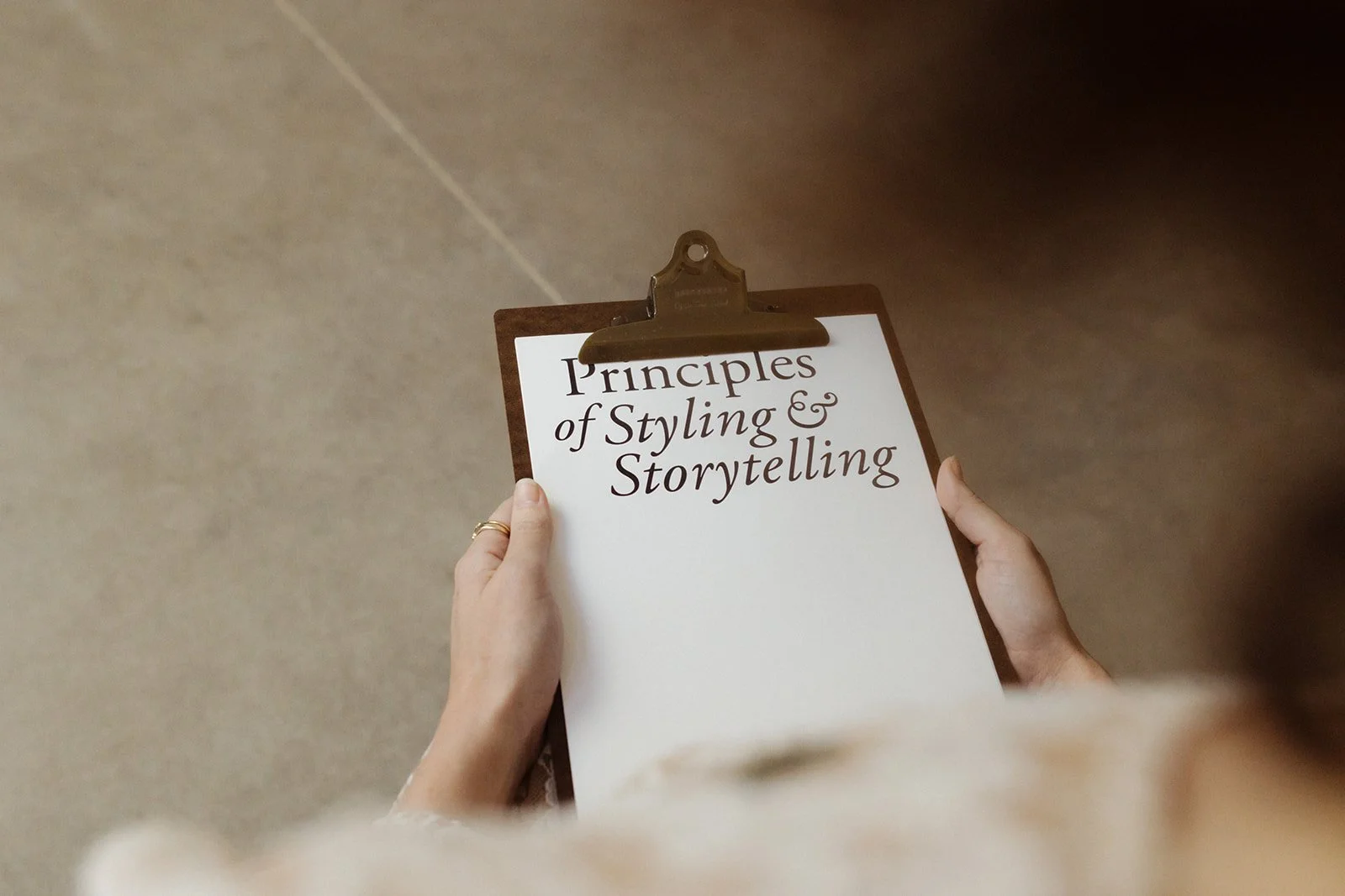
LESSON 4
Principles of Style
This is where people usually want to start, but as you’ve realised, there’s so much more that goes into understanding yourself and your project and what you’re actually designing and buying for or making, before you go out and do it.
For those of you working on your spaces, I know you will be absolutely eager to finally dive into getting your hands dirty with this chapter, so thank you for your patience with doing the groundwork so far! If you’re working on your craft or business, the principles in this chapter are going to be so important for you for styling your own shoots and business spaces, so please complete this chapter and the next, with that in mind. I know some of these skills might not be immediately useful to you, but they certainly will be down the track in your business and life.
Whatever the reason you have joined us in this school, I want you to work from a place that knows styling is another way you get to tell people your story – just visually this time instead of using words. I also want you to believe that it’s absolutely a science – replicable because beauty is a mathematical formula (a fact well-known by artists and mathematicians throughout time). Which means, if you know the science and rules to styling, you can style – I promise! Anyone can. But what will make yours iconic and penetrating, is when you shape it from your story.
All of that said, I know it can still be so very overwhelming when you start. What to buy? What to do? What’s the point? That’s why we’ve already done much more of the heavy lifting than you realise – getting sorted on your values and story, and negotiating all that planning will save you thousands in time and unspent dollars. So trust that you have your map (this class), and you already know your north star (your story), and let’s begin. In the industry, you know, no matter whether we’re styling a bookshelf, whole house or your new creative business, this is the same process we go through.
A few things you should know…
I’m confident when I say you’ll be able to do your own styling so much better than anyone you could ever hire, because it’s you who knows your story. After teaching so many wonderful souls over the years, this is one of the standout lessons: if you have the rules, and you follow them, you will do well. You know what you prefer visually and you do not need a stylist to understand what looks beautiful. Trust me.
You may be saying, yes but I just don’t know what to buy and where to put it. And, again, you do. You know what to buy and you know how to put it together. It’s just that, up until now, you haven’t been taught the method behind it. So, don’t worry, stick to the steps and follow the process. I promise your project will reveal itself.
Let’s get organised.
Below I’ll give you 10 Rules for Styling. Together, we’ll go through each, explaining what they mean and how to apply them. I’ve included visual examples, showing the rule applied and not applied, using the experiments we shot for my book, Principles of Style. By the end – with plenty of practice – you’ll be calling yourself a stylist.
This week, your homework is even more crucial than normal. Commit to doing the exercise and make sure to practise, photograph and share your work. When you post, that’s how I get to see what you’ve been creating and how far you’ve come – and of course, so do your community who are also taking this class with you!
Oh! And, of course, remember to have fun!
Lesson: The 10 Rules of Styling
Rule one: Curves speak of life
The natural world is made up of curves – birds’ eggs and feathers, tree trunks, leaves, waves and clouds. Everywhere you look, you’ll see curves. There are straight lines, too, but they’re definitely outnumbered by curves. Curves have also been part of our homes since we started living in caves and tents, but somewhere along the line, decoration, age, signs of wear and the curved form began to get downplayed in modern houses, and lines and angles became the hero. I think it’s because they’re cheaper to build. The house I’m living in doesn’t contain a straight line and no walls meet in a corner, and I love it for that. The bricks are all laid so the rooms are rounded, and each doorway is an arch.
Curves, both in nature and in the spaces around us, make us feel human, comfortable and safe. Even if your home doesn’t contain any curves you can introduce them, and you’ll be surprised how welcoming it will start to feel – circular rugs, round lights, tables and bowls. Much more subtle curves help even more – a folded blanket, the slightly curved spines of secondhand hardback books, the rounded arm of an old chair. Bring in a few natural objects themselves, such as dried grasses, pebbles, branches and whatever else you can find.
You’re not trying to get rid of the straight lines altogether in your home, but just trying to balance things. Just because you have an enormous rectangular window doesn’t mean you have to match that equally with curves. Try to balance the ratio of curves to straight in your home to create harmony.
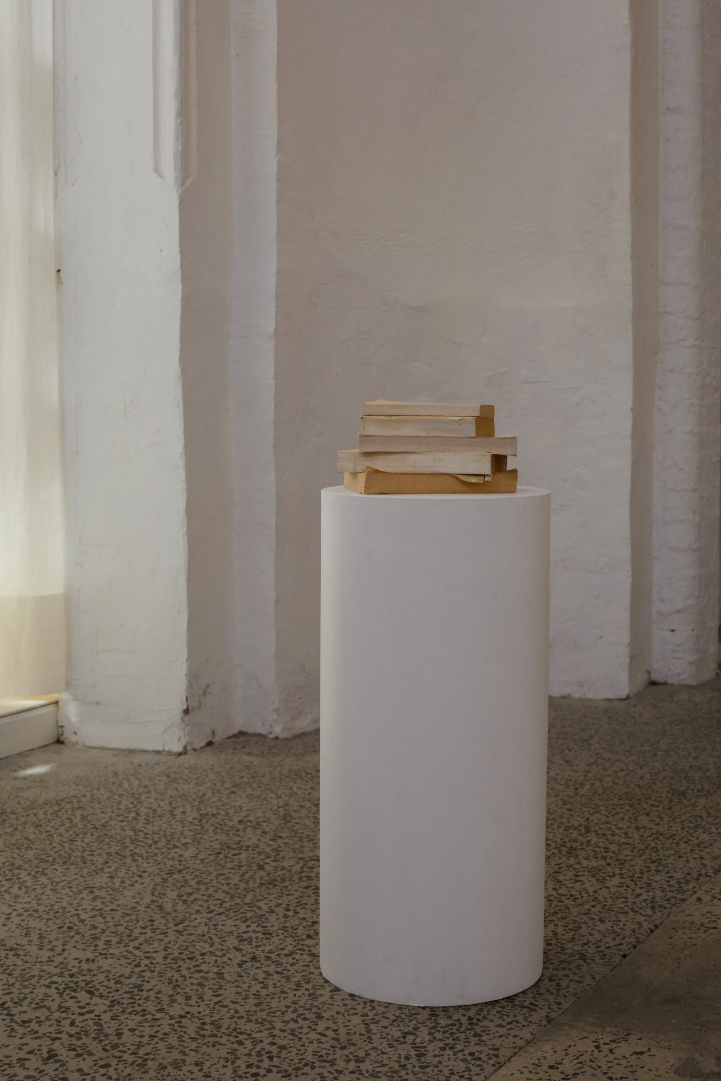
In my book, Principles of Style, we experiment with this rule. Below you’ll find an example, and consider which image you prefer and why. There are no right or wrong answers here – it will just show your preferences to you, which you can use in your work moving forward.

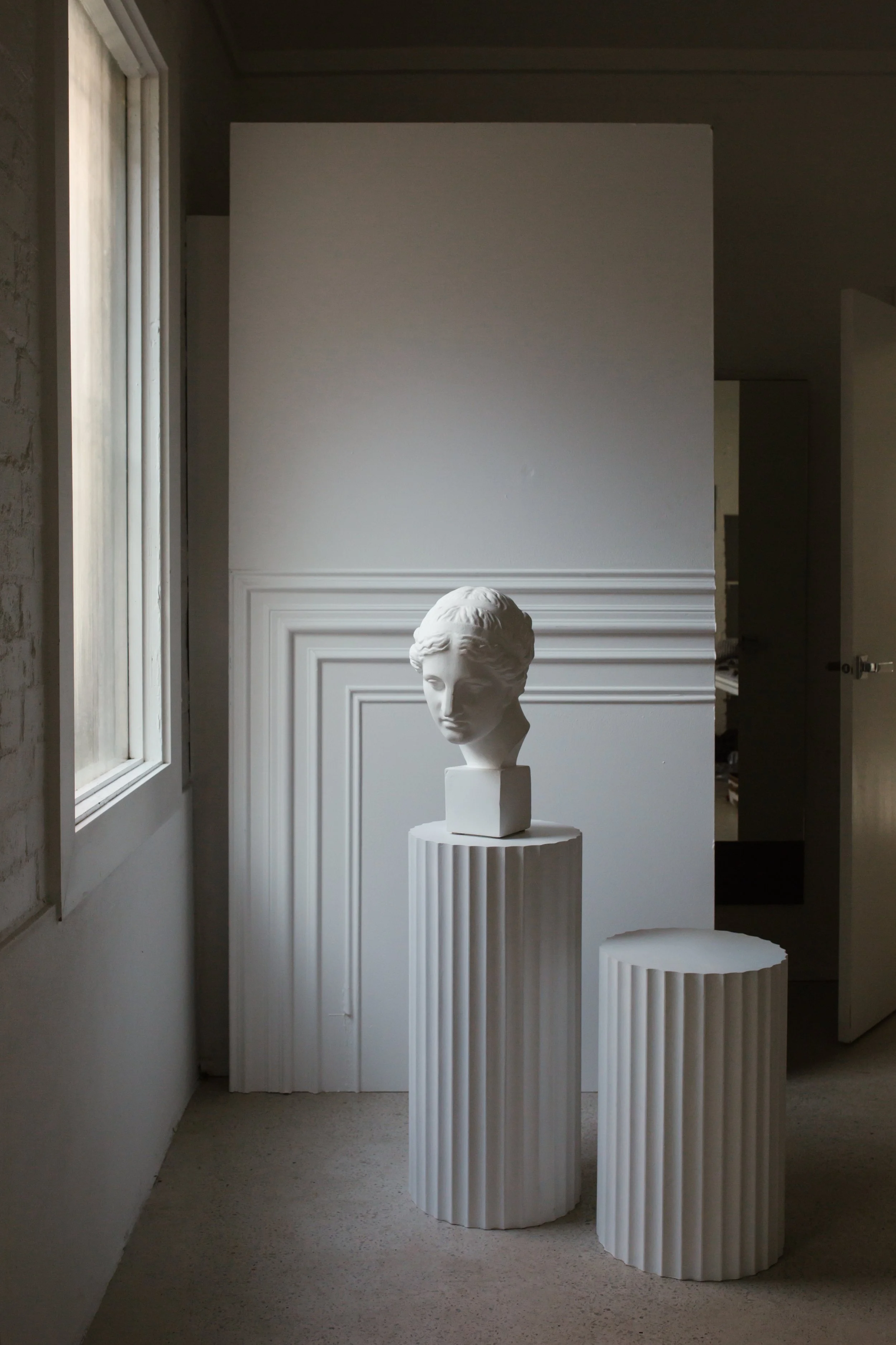
Experiment 1. An object, no matter how humble, takes on a level of grandeur when it’s standing on a column. Even a small pile of books starts to look special when it’s elevated and given a certain status on this square column.
Experiment 2. Let’s see if we can improve things with a round column. I far prefer this look – for me, the curve brings a sense of grace, whereas there’s a rigidity to the square column. Both options are beautiful, and both have their place; it’s all a matter of taste.
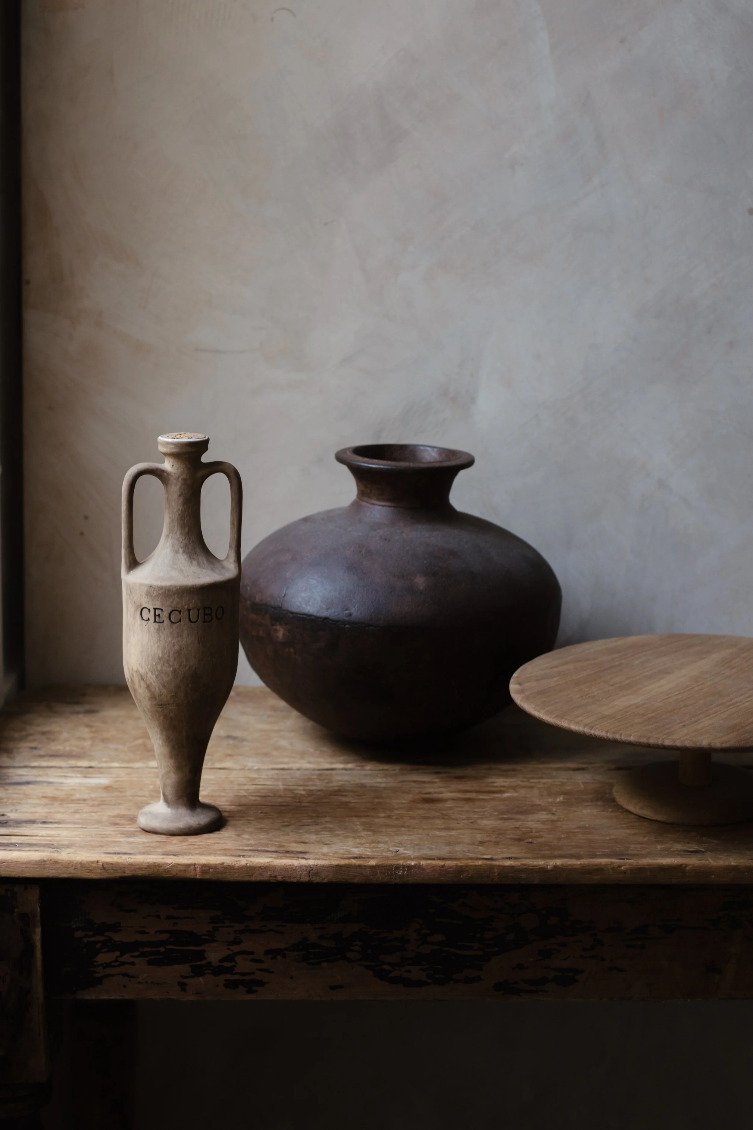
Rule two: The triangle is a powerful figure
It can be overwhelming trying to arrange all your belongings in a space until you realise that certain patterns can tie everything together. The triangle is such a useful figure in that way, and is often used by stylists, florists and artists – what it really means is creating high and low points. It was one of the first styling rules I learnt, and it’s never really failed me. When you’ve collected everything in one spot, have a go at assembling things into triangles of different shapes and sizes – you definitely don’t need to be too precise about it, but just use the triangle idea as a rough guide. What you should be aiming for are high points and low points, and making everything feel relaxed and not too thought out. At the back you’ll have larger triangles, and they’ll gradually get smaller as you move towards the front. On shelves and flat surfaces, think about the triangle as you make little compositions of objects – by the time you’re finished, you’ll find layer upon layer of triangle. This way, you will have transformed possible chaos into a space filled with rhythm and interest – you’ll be able to take it in gradually as your eye moves from one triangle to the next.
Let’s explore the examples below, and consider which image you prefer and why.
Experiment 1. Putting spaces together isn’t rocket science – it’s chairs, lights and tables (and a few other things) and we shouldn’t be afraid of it. When you have things around you that you love, just put them together and see how they look.

Experiment 2. The most comfortable way to put things together, I think, is with one high point and two low ones. Even though the first experiment looks good, the addition of the two tiles, which I chose because I liked the colour, makes the space feel finished to me.
Rule three: It’s important to be different
This is such an obvious rule – in order to make your home memorable and comfortable, you need to fill it with pieces that are unique to you, and that hold meaning for you. The sorts of places we either visit or see in magazines that stay in our memories the longest are the ones that are unique and reflect the person who lived there.
I’m not saying that you can’t look to books, magazines or Instagram for inspiration; or that everything around you has to be handmade. It’s more that you take your time putting it together so that it’s right for you, and the life you live and have lived. Believe me, we’re all different – and if you’re authentic in your choices, your place can’t help but be unique and memorable.
Let’s explore the experiments below, and consider which image you prefer and why.
Experiment 1. Let’s see if we can create a beautiful vignette, using what we’ve learnt so far – rounds, triangles and something different. This looks good, but I think we may be able to do something more interesting.

Experiment 2. Let’s do it again and try to make something more memorable. I know everyone has images in their minds of things they’ll never forget. The key to making these memories is often the unexpected.
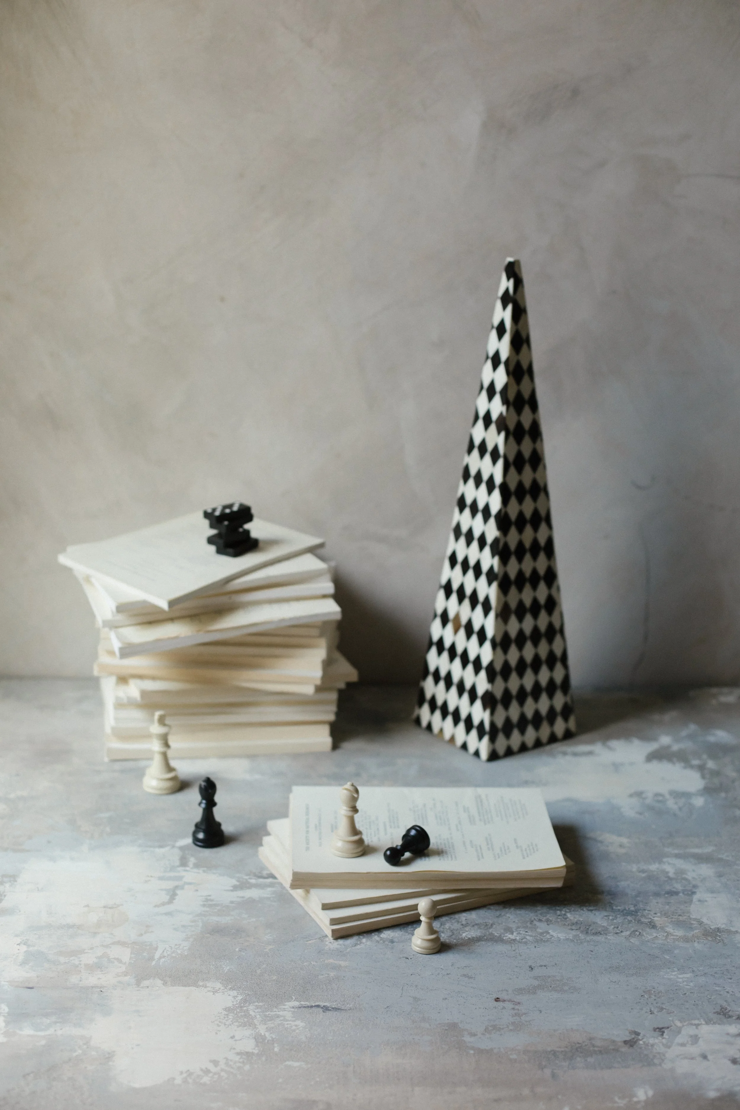
Rule four: Think about textures and layers
When it comes to textures and layers, I like to work in odd numbers – three, five and seven. It’s something to do with being slightly off, which to me, feels human. And slightly magical, too – many of our favourite childhood characters came in threes. Bears, pigs, musketeers!
If you work in even numbers, there’s a temptation to make everything match. There’s a risk, then, of it looking too neat or predictable. Neat, to me, means forgettable. As long as you have plenty of textures and layers in a space, there will be a sense of discovery, and you’ll notice different things and make new connections every time you spend time in it. At the other extreme, in a minimalist space, you might find one artwork on the wall, a couple of pieces of furniture and a lamp. You’ll be able to take in the room in one glance, and it might seem dramatic at first, but won’t make much of a lasting impression. With a more layered approach, you can spend time exploring, thinking, feeling and understanding it.
Explore the experiments below, and consider which image you prefer and why.

Experiment 1: Let’s have a play with numbers here. Start with a collection of four beautiful objects with varying textures and a colour palette that works well together. Move them around until the arrangement looks as good as it possibly can. This is lovely, but I think we can do better.
Experiment 2: Take one of the objects away and keep playing. To my eye, the three together look so much better and more memorable than the four. Three is the smallest number of elements you can put together to create a pattern. To me, the objects now stand out like three concise bullet points on a page and I can enjoy them.
Rule five: Focus on the unexpected
There’s a usual way to do things, and a not-so-usual way. I tend to go with the latter as much as possible – it makes life much more interesting and exciting. In terms of putting a space together, you can either hang artworks at eye level on the wall or you can hang them unexpectedly, in a spot where you might have to bend down to look at them properly. You can put books on a bookshelves or run them along the skirting board, or put a pair of shoes on the bookshelf – you get the idea. In my pantry – one of my favourite places at home – as well as all the supplies, you’ll find abalone shells from my first dive for them off the coast of Tasmania, a sea eagle’s egg in a shallow pewter goblet and other things that give me solace.
You might worry about things looking odd, and will probably need to experiment until it feels right. Along the way, you might find that you don’t have space for all your bits and pieces, which can be hard. Once you’ve arranged your space with objects in unexpected places, your brain will connect to them in a new way, and you’ll have an immediate response.
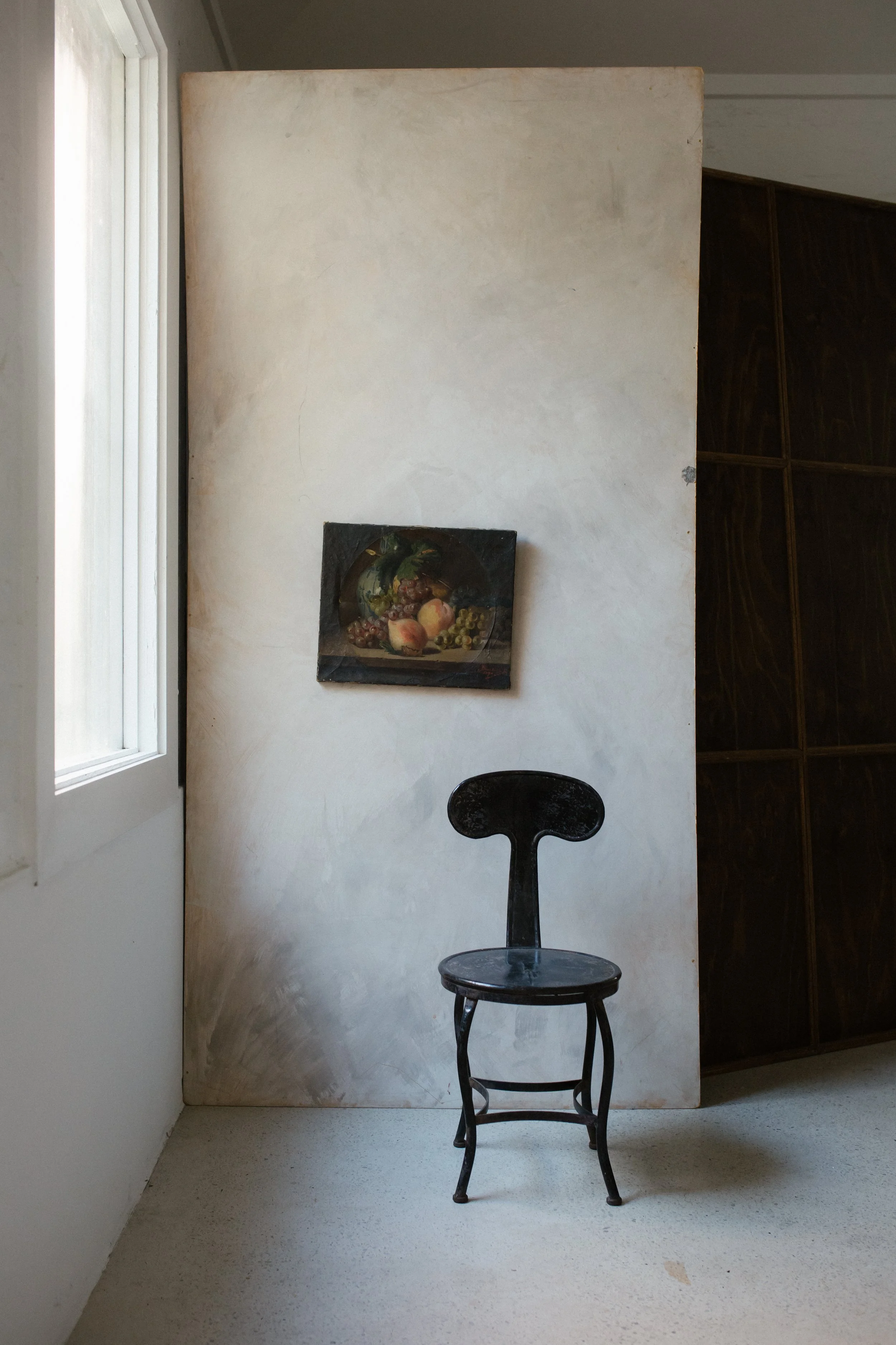
Let’s explore the experiments below, and consider which image you prefer and why.
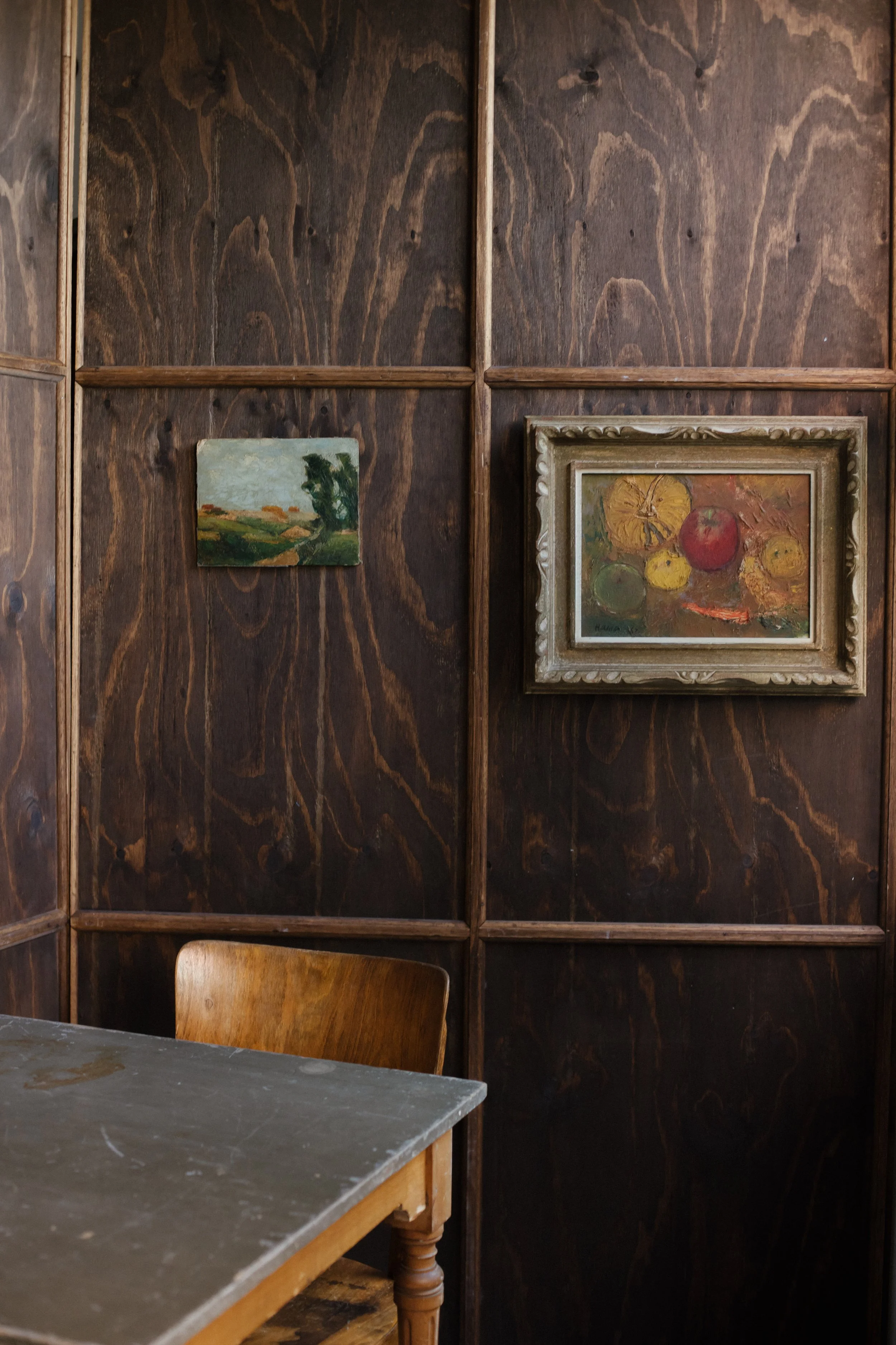
Experiment 1: I came across a formula about how to hang a picture – the centre of it had to be at around 150 cm from the floor, then you had to divide the height of the frame by two, take away the distance from the top of the frame to the hanging hardware, and add this to the 150 cm. We tried that here; it looks fine, but I think we could do better.

Experiment 2: If you want everything at eye level, you need a complicated formula. But, to me, it’s much more memorable when things hang at different heights and in unexpected places. The next experiment could be to move the paintings down to the lower panels to see if that looks even more interesting.
Rule six: A place contains stories
This is what you learnt in Lesson Two, but it’s worth talking about again and emphasising just how important it is. As humans, we just can’t help telling stories – we even do it when we’re asleep. It makes sense that the spaces around us we connect best with also seem to talk to us; we instantly understand them, and how they want us to use them. Of course, you want beautiful things around you, but I feel that everything has to have a purpose, echoing part of the story you’re trying to tell. It doesn’t all have to happen immediately – think of it more like writing a novel, chapter by chapter, letting it gradually evolve over time, editing along the way.
Once you start to think this way about your spaces, they start to truly become alive – and once you start to build your story around you, you’re building your own world. Which is a magical thing.
Explore the experiment below, and consider which image you prefer and why.

Experiment 1: We all love good stories, because we can imagine ourselves in them. Let’s experiment with some beautiful objects and see what happens. To me, this looks as if it’s setting a scene; I want it to do more than that.
Experiment 2: By adding the extra elements, we’re now telling the story of who’s been there and experienced the space. There’s a good story here that draws us into the image, make connections and tell our own stories.
Rule seven: Look for balance
In putting a room, or a whole house, together, you need to work out how much stuff to put in it. It’s tempting to put in everything you’ve got, but that can be overwhelming – you need to be a bit restrained, to give your eye the chance to take it all in gradually, have little rests along the way, and not be bombarded by pure beauty. Objects close to each other should have a relationship and tell a story – with practice, you’ll find those links, which will be personal to you.
Taking stuff away is just as important as putting things in – or maybe even more so. The funny thing is that with too much beauty around you, it starts to all look less lovely. Again, just experiment – I know I do.
In order to find balance, there should be quiet areas as well as busy ones – a good rule of thumb is about 50:50 of each, but that can vary slightly depending on what you’re trying to say about your world. If it’s wild and bubbly, you might want to amp things up; if the aim is to feel calm, dial it down. When you pin it down, it’s a beautiful thing.
Let’s explore the experiments below, and consider which image you prefer and why.
Experiment 1: What I like to teach students is to start with 50 per cent of a space filled with elements and 50 per cent empty, and then play with the ratios up and down to either create calm or create a bold charming story.

Experiment 2: The first experiment looks a little too calm to me, but you might find it just right. Adding one more element, to me, really adds life to the setting, but still gives the eye plenty of room to rest.
Rule eight: The visible and the invisible
There are some objects in our homes that are super useful, and often necessary, but don’t look great – fridge, TV, toaster, washing machine, desky things. When everything’s out and on show, it can start to feel chaotic. It feels very powerful to make things disappear, so find ways of hiding them where you can. I put all my appliances in cupboards, or behind doors or curtains. I don’t leave anything in packets in the pantry – it all goes into glass jars. A living room looks so much better if the TV is hidden away in a cabinet or tucked into a bookshelf. Put all your desk supplies in a drawer or box if you can – nice and handy but not on full view all the time. Mine go in tiny baskets – one for pens, one for cords etc. It’s nice to feel relaxed when you open hidden spaces. One of my students pointed out when I showed her my cupboards, ‘It’s like it’s living its best Pinterest life!’ I love thinking about it like that. Of course, we all have cupboards that are not so beautiful – I try to avoid eye contact with them.
Let’s explore the experiments below, and consider which image you prefer and why.
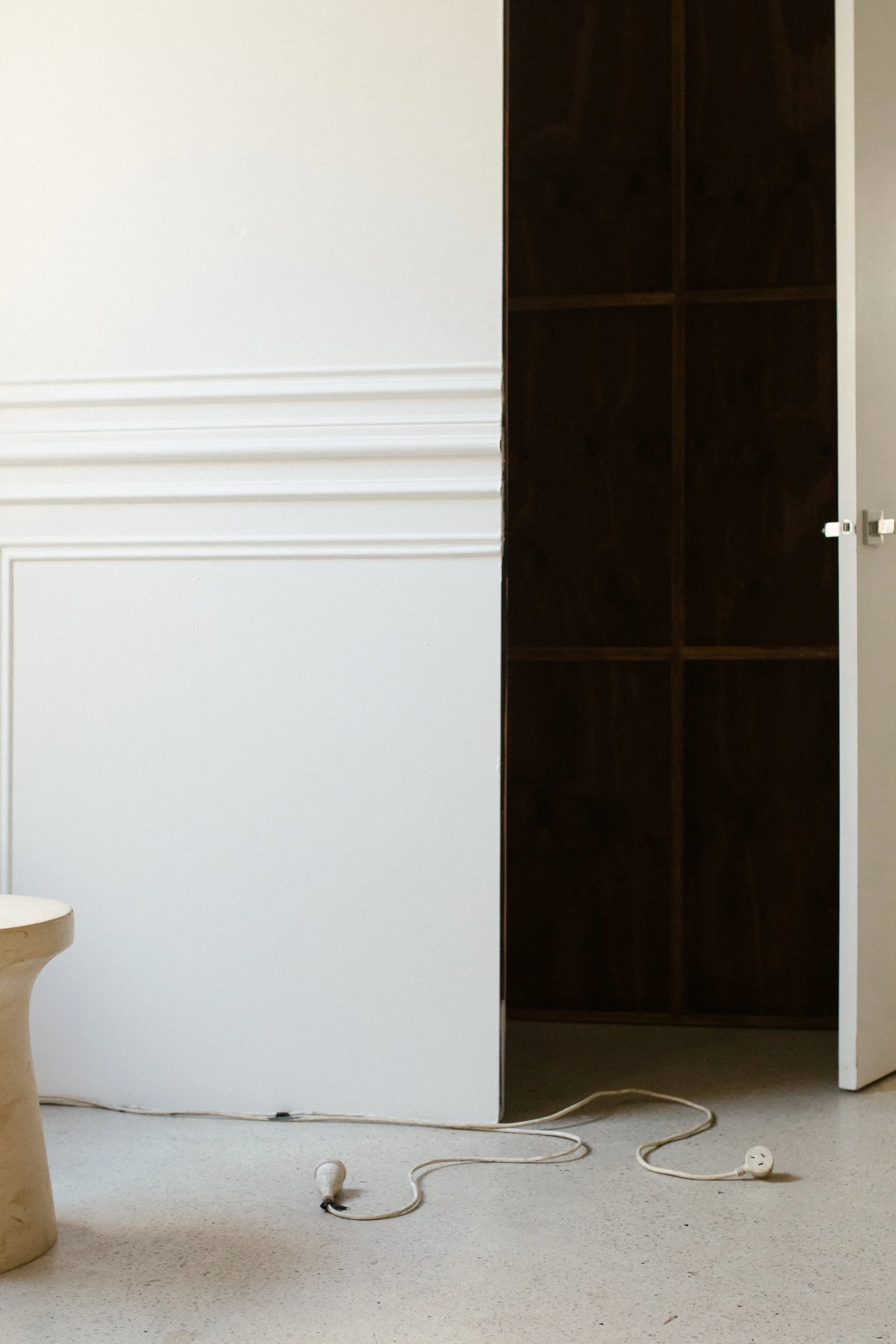
Experiment 1: It’s unavoidable that we need to live with practical things, but I always try to hide them in any way I can. This cord at ground level is fairly inconspicuous, but I’d rather see what we can do to hide it a bit.
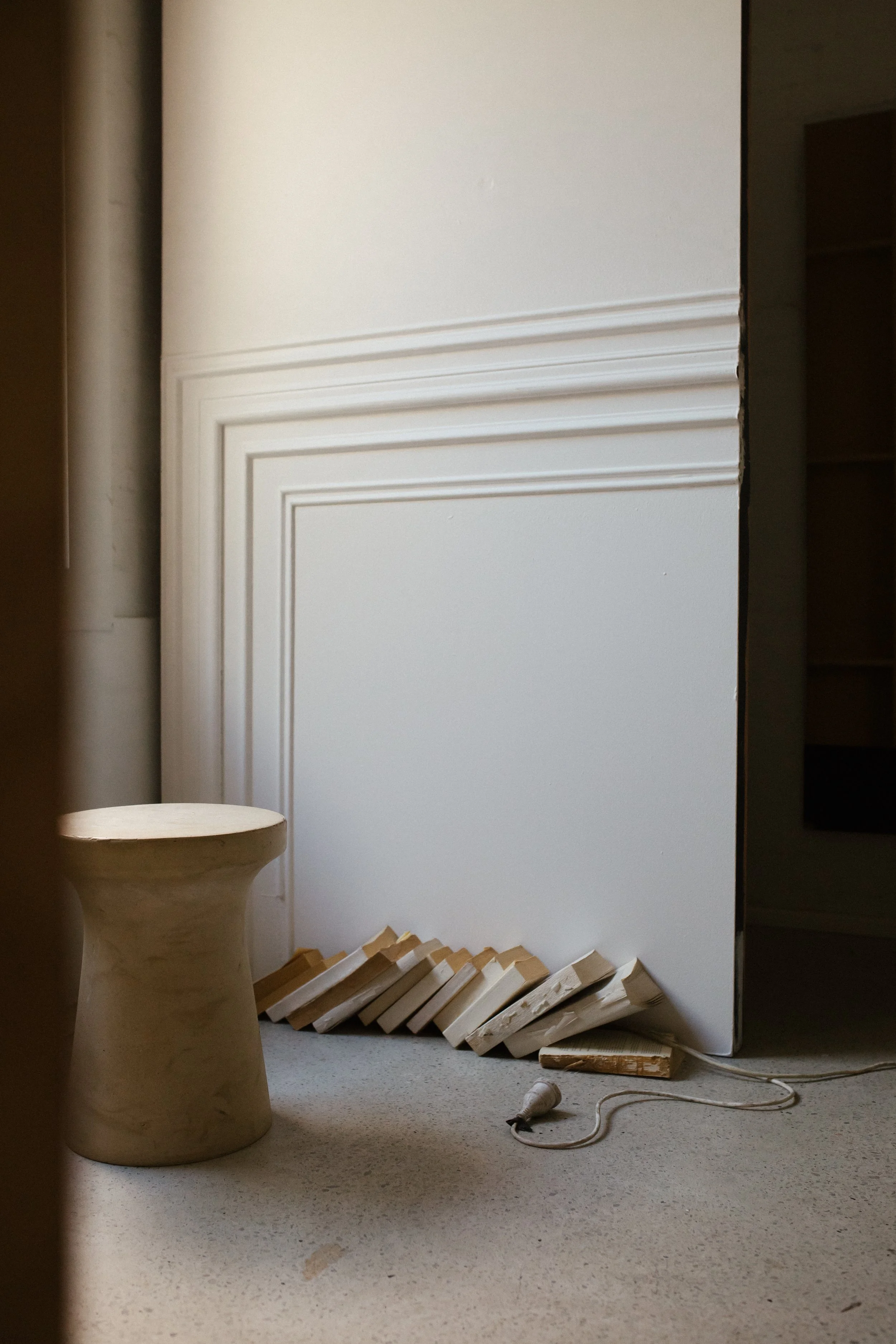
Experiment 2: Remember the earlier lesson about putting objects in unexpected places – that’s very useful here. Some old books in an unlikely spot conceal most of the cord that we might need to plug in an essential appliance; true inspiration and creativity come out when there’s a challenge.
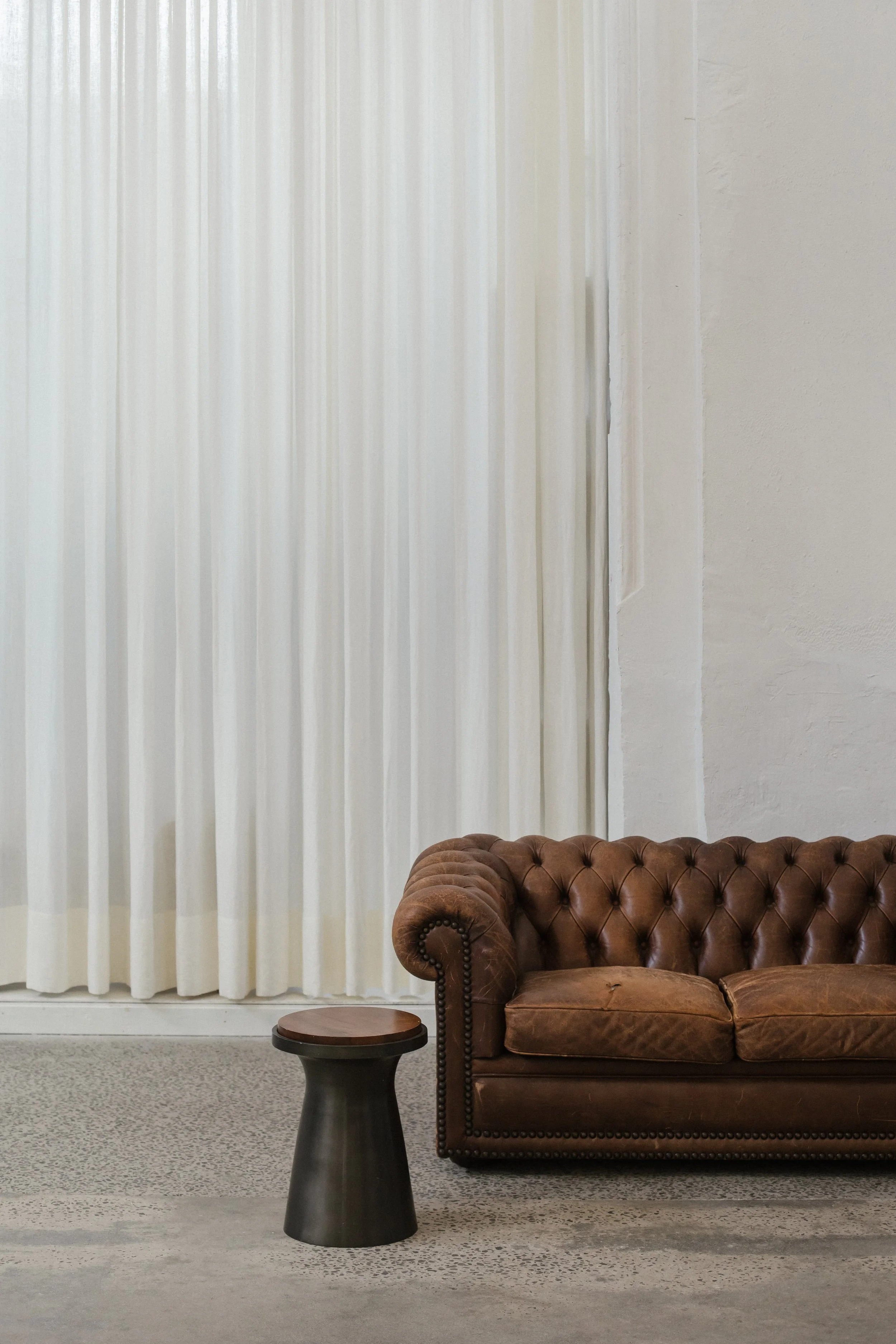
Rule nine: Eyelash testing
I’ve found a clever and really easy way of discovering whether something is working or not, and I call it the ‘eyelash test’. One thing I love about this rule is it works almost on a subconscious level. Once I’ve styled a space and feel it’s almost there, I’ll squint and see what colours are leaping out and looking out of place. For me, it’s often reds and yellows that do – colours that in nature spell danger. Having said that, sometimes I’m really surprised by what does jump out – it can be something really small and beautiful that you don’t really notice when your eyes are open. It’s amazing how much better the space will look without it. I repeat the eyelash test until the space is calm and still, and I can see that it looks just right.
Let’s explore the experiments below, and consider which image you prefer and why.
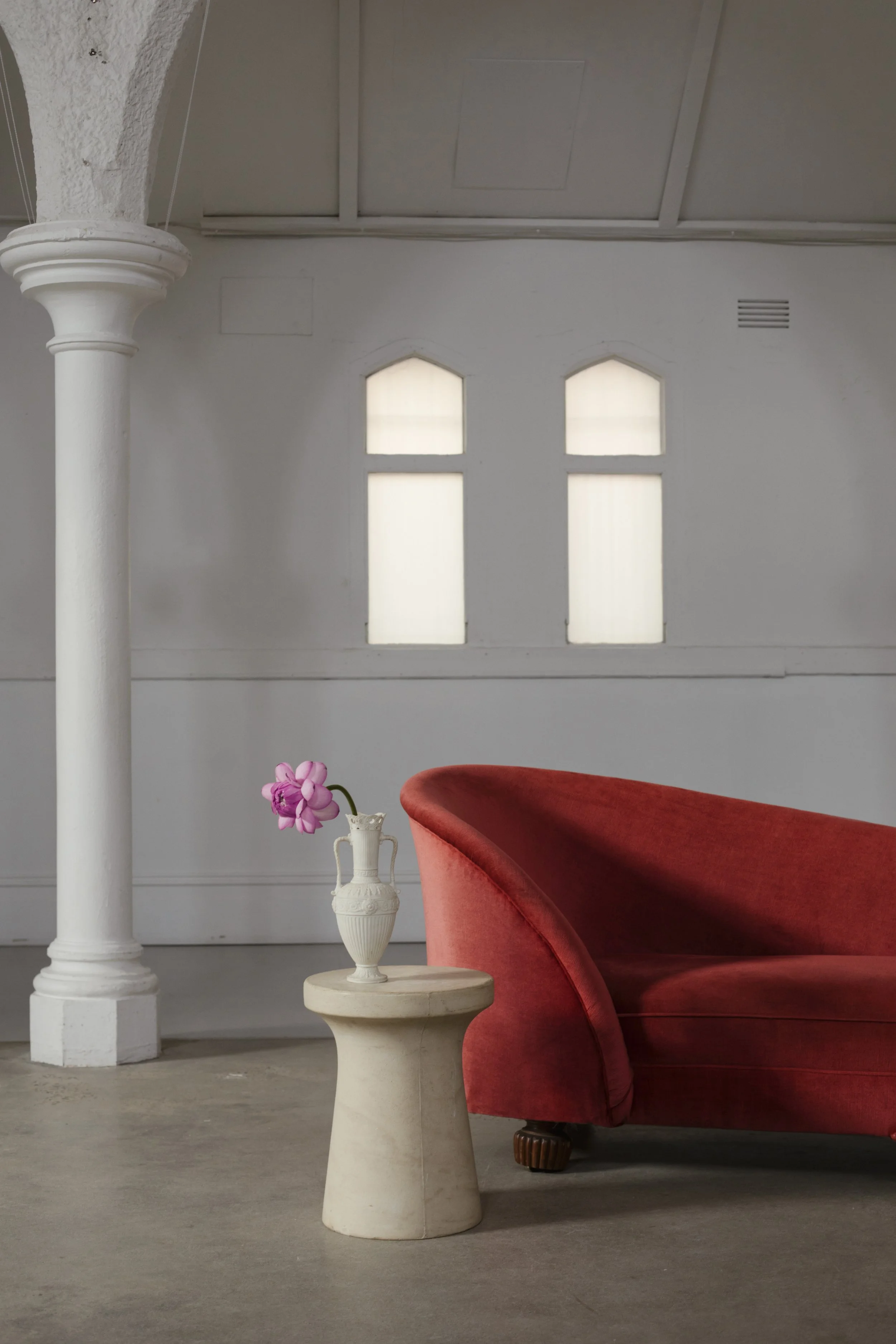
Experiment 1: There isn’t a single thing that isn’t beautiful in this image, but using my eyelash test on it, the two colours of red in the couch and flowers clash. To me, it would be better without one of them.
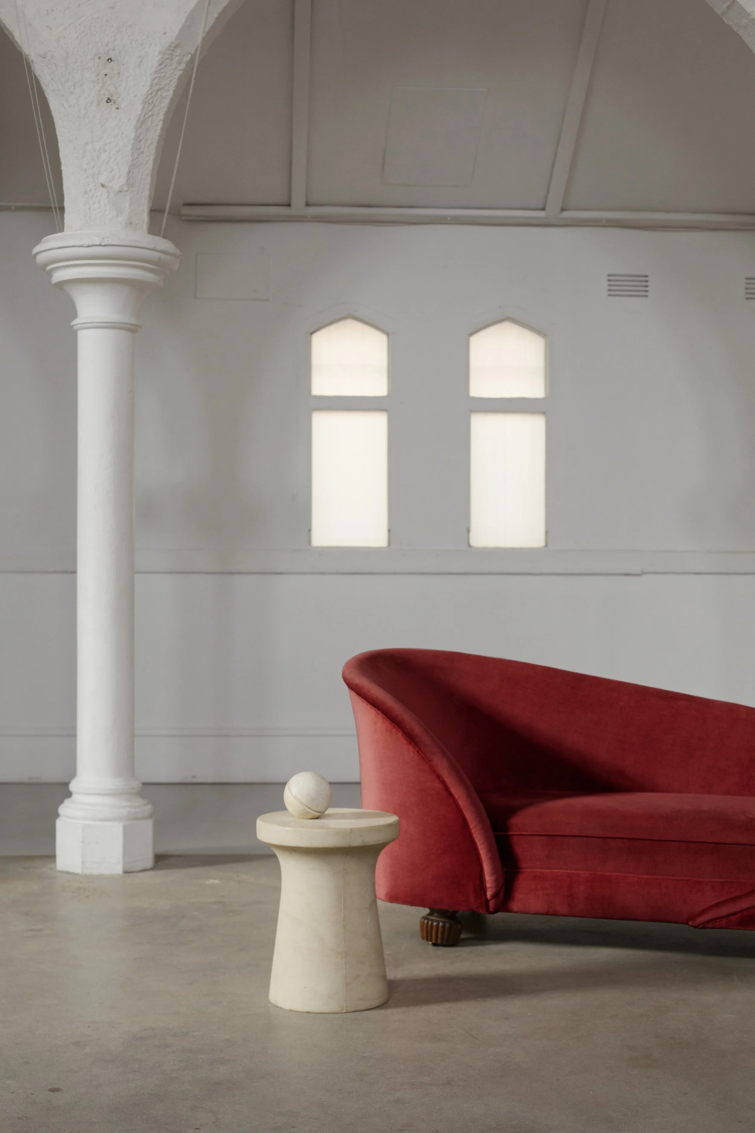
Experiment 2: By removing the flowers and replacing them with the ball instantly elevates the space to one that feels considered and balanced. If I had a vase of different blooms on hand, it could be a completely different story.
Rule ten: Use colour
I’ve only recently become a lover of colour – I think, before then, I wasn’t brave enough to use it. It’s crazy, really – if you ask any child their favourite colour, they’ll have an answer immediately. Mine was pink; what was yours? I think I stopped loving the idea of pink when I started reading interiors magazines and noticed that virtually every house was white. I thought that’s what houses had to be. Another good reason to go with your heart, and not with what you see in magazines. There are shades of pink in the evening sky that move me so deeply I feel an ache that can only be located in the exact spot my heart is.
When you’re putting your space or your ideas together, I know it feels safer to go for something neutral, but you’ll end up with something that’s forgettable in every way. That’s not why we’re here – we’re here to create something memorable, beautiful and entirely your own. Forget trends and fashion, colour has everything to do with emotion – it’s something deep within us, highly personal and completely individual. Colour Psychologists have proven that the hues we choose have a significant impact on our emotional state. There are numerous studies that show that when our eyes connect with a certain colour, chemicals are released into our brain helping shape the way that colour makes us feel. We can leverage the science of colour to help create a desired effect.
Here is a breakdown of the psychology of colours.
Red: The warmer shades of red spark energy, courage, passion, adventure and ambition. It helps ambition, conversation and appetite so consider it for foyers, dining rooms and living rooms. Red creates the strongest first impression.
Orange: Another warm colour, but a little more subtle than red. It stimulates joy, enthusiasm and playfulness. An excellent choice for gathering areas.
Purple: Is associated with luxury, nobility, and sensuality and suggests a sense of depth. Dark purples are rich and dramatic, and lighter shades such a lavender are akin to how blues make us feel (see a bit further below).
Pink: Helps us convey femininity, nurturing, kindness and softness. It has a calming and compassionate effect on the viewer.
Yellow: The happiest of all colours, use it to create cheer, creativity and positivity. Yellow is said to reduce depression, and spark laughter and increase conversation. Ideal for gathering spaces.
Blue: The colour of sky and ocean is the most natural of all colours. It invokes harmony and calm – so consider it for bedrooms and bathrooms. It’s said to reduce blood pressure and heart rate.
Green: Is closely paired to blue as it is another natural, calm natural colour that makes us think of trees and meadows. It is considered the most restful colour on earth, so consider it for spaces and places that are used for serenity and stability. Dark green is an excellent choice for anything masculine and conservative with an implication of wealth.
Blacks: Help represent sophistication, masculinity and clarity – and its counterpart, grey, communicates intelligence, calm and wisdom.
Browns: Are great choices to represent honesty, home, high morals and invoke safe and secure environments.
Whites: Are the symbol of purity, simplicity, cleanness and optimism. It is a great base to add in other colours.
If you can be bold enough to use colour, it is a very achievable way to make the largest impact. Whatever your project, think about what you are trying to achieve, and use the colour psychology to help you where possible.
Now, back to the usual format of our experiments, let’s consider which image you prefer and why.
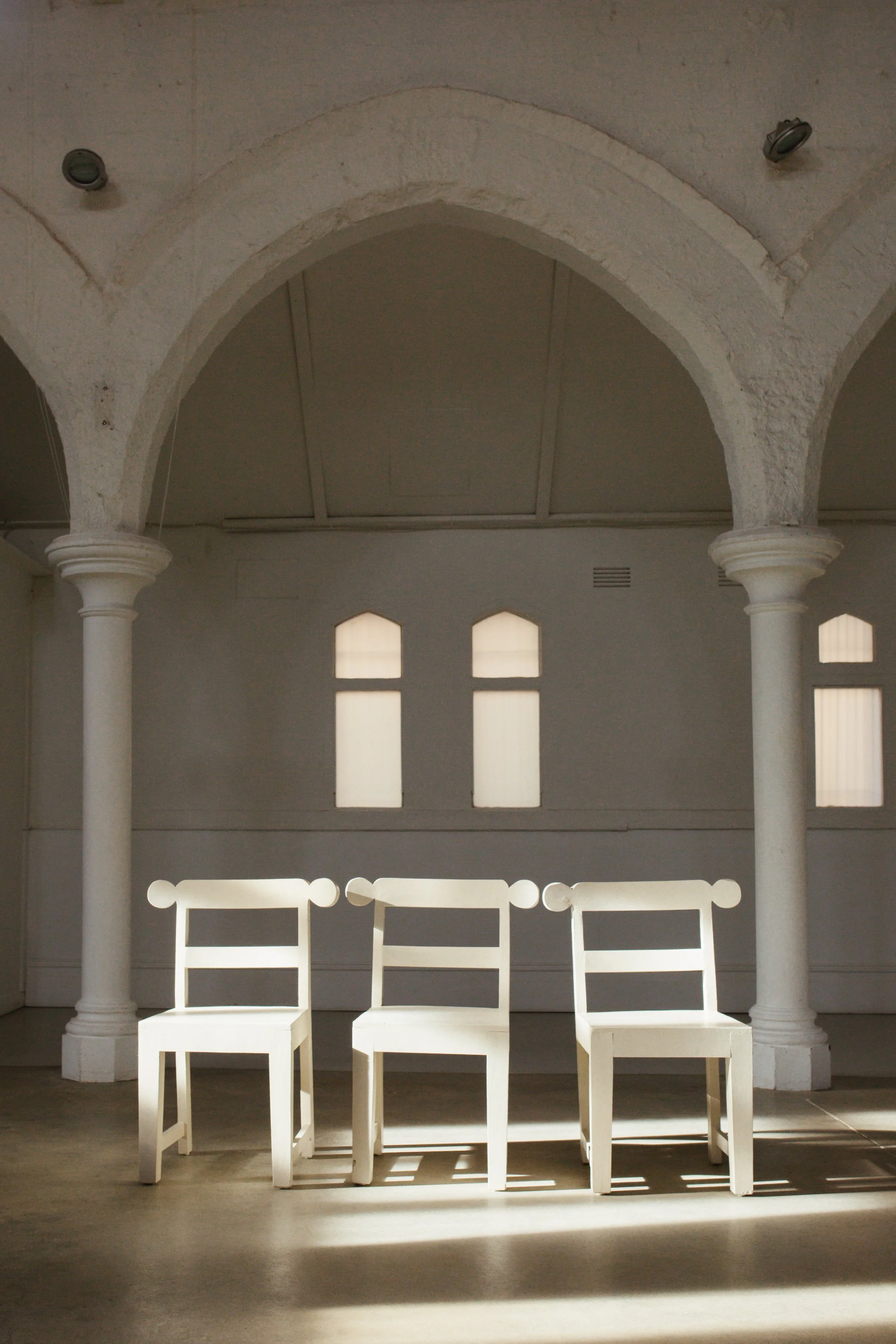
Experiment 1: Colour is the most powerful and effective way to communicate and can create instant story. Let’s try this first with minimal colour; the three chairs look lovely together – the power of three – but, to my mind, just a little too quiet. It’s not a scene I’d remember.

Experiment 2: Adding a coloured chair, for me, creates a moment I want to dwell on rather than appreciate and move quickly by. It’s playful, but the interesting thing is that if you added a second coloured chair, it would dilute the effect of just one.
Workbook Time. Reach for your workbook, and complete Exercise 4.1, now. It’s time to play, by doing — your knowledge of the 10 principles of style will become ingrained wisdom that will start to flow naturally. Remember to photograph your space before you adjust it, and after – so you can analyse your work.
Lesson: Planning, Buying & Styling
So, here is where people get stuck. They tick off their story & values, their mood board and plan; they understand the science of styling, practise a little bit, get the gist and are really proud. But then, when they get to the actual doing, they get frightened and reach for outside help or advice, going down a steep (and deep) spiral of indecision, landing in the murky waters of mixed aesthetics or, interestingly, a very bland result that’s hoping to please everyone.
What I want you to do – or what I would do if you had hired me – is to make decisions based on your unique story and mood board. Make sure you are completely happy with them before you start, and take them everywhere with you, on every sourcing and shopping adventure. They are your touchstone.
So … what does actually using your story to make decisions look like? Well, if you’re considering lighting options and one of your key story elements is ‘humble’, you wouldn’t choose a shiny, modern pendant, or a chandelier, or antique crystal – you would look to a bare bulb, cords, wire, maybe old ropes intertwined, very aged fittings that would have been cheap back in the day.
Another example: Perhaps you’re looking at tiles for the bathroom and your home is a beach house and your story is ‘relaxed’. You wouldn’t go for a pattern or black and white checker, or subway tiles, or something even more formal. Perhaps the solution is a basic concrete tile that’s been tumbled or aged, something very unfussy.
One more: If you have a cottage and your story is ‘Victorian’, you wouldn’t select the sort of black tapware that is so popular right now – you’d want to choose traditional fixtures that speak to a bygone era. You’d forego a big, round, modern bath for an old clawfoot. You see?
Write this down in your notes: “When I need to make a decision, I look at my story and ask what fits.”
Try to not worry too much about the end result, I promise it will all come together perfectly. Trust the process.
A few final thoughts on styling … Every single person I have talked to or met, whether they’re a student or an expert in the industry, has self-doubt when it comes to styling. Don’t let this stop you because everyone has it. It’s so important to practise and play. Also remember that it’s going to be successful if it comes from you, because it’s going to be authentic and yours. It’s also important to get comfortable with this feeling of self-doubt because no matter how successful you are or however much you’ve done, it will always be there in some form or another. I think it’s an essential part of the creative process – it means we’re always testing ourselves and we’ll never stop learning. It’s reassuring to know that everyone feels it, and that there’s a positive side to it. A writer friend of mine told me a story I’ve never forgotten – a journalist she knew said to her that she’d ‘cracked’ journalism. All my friend could think was that it was no wonder that particular journalist was such a terrible writer. So, embrace self-doubt – it’s up to you how you want to use it.
04. Homework
Watch: Feats of Memory.
Watch: The YouTube Series by The New York Magazine, Interior Lives with Wendy Goodman. See if you can start identifying the 10 principles in these incredible, diverse and inspiring homes.
Purchase: My book Principles of Style for examples of spaces that utilise the principles well, and spaces that incorporate all the principles as a whole.
04. Community
Any work, or ideas you are posting related to this class, please use the hashtags #principlesofstyle and #poss04 so your fellow classmates can connect with you and continue to grow this community.